It feels good to get back in the swing of school though. The first classes I worked with this week were the 4th graders. The lesson focused on the 4th grade standards of identifying contrast and using complementary colors.
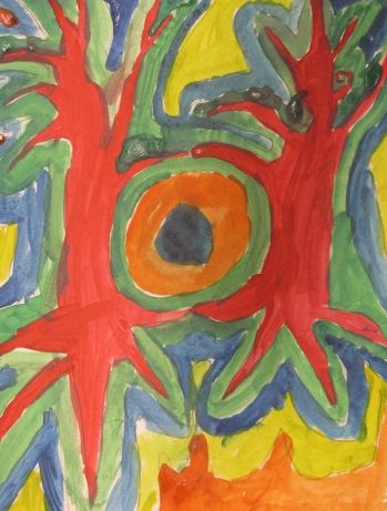
The lesson was inspired by an image I found on pinterest, which identified Hunsertwasser as the inspiration for it. I have not been able to track back to the origin of the project, so if anyone reading this knows, please let me know:)
Hundertwasser was an Austrian artist who was inspired by nature. He combined elements of landscape, portraiture, and architecture into brightly colored and layered works of art. I have admired his work for a long time, dating back to my college years at Tyler School of Art in the early 90s.
I shared several of his paintings with each of the classes. I talked about how he would use complementary colors in some of his work to make areas pop or contrast against each other.
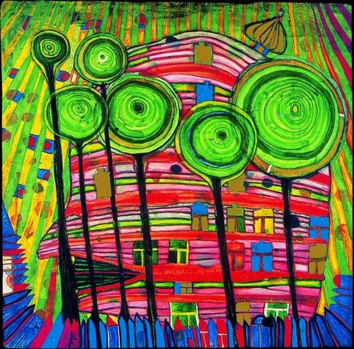
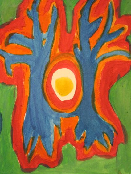
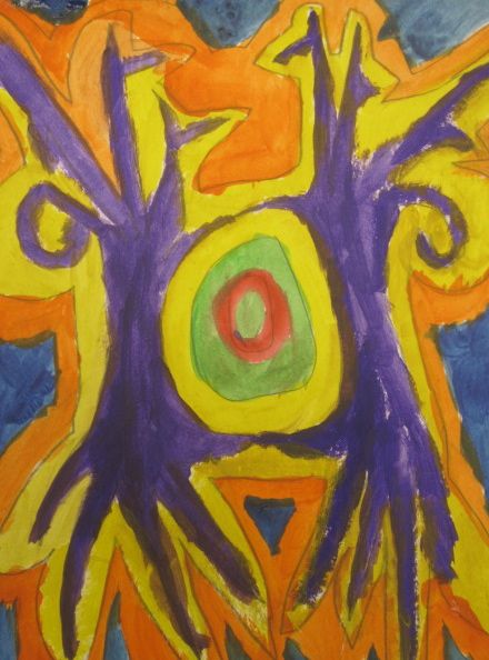
In the above example we addressed how the trees really stood out against the red head behind them. This would not be the case if the head was done in blues or yellows. I also brought up Hundertwasser's use of layers and repetition in his work. Some parts of his work could be thought of like the inside of an onion. There is a big containing shape, but there could be many layers that get smaller and smaller inside it.
I thought this project was appropriate for our winter return to school because of the use of barren trees. We discussed how trees often lose their leaves in winter, even though we don't get a lot of it here in San Diego:)
We drew out the composition together, although I stressed that everyone's would look different due to shape types, shape sizes, shape spacing, and color choices. We drew out our oval center first, with at least 3 rings. I emphasized that the largest oval should be about 1/3 of the height of their paper, so their tree trunks wouldn't be too small. Then we drew our trunks, roots, and branches. Our borders came next, and as a rule of thumb (haha) our borders should be about a thumb width wide.


When it came to painting, the students had to pick one color for their trees and then use it's opposite/complement for the first border. After that, they were free to use any colors they liked. Before I let them at it, I did a demonstration on how to paint large areas and narrow areas using our 1/2 inch flat brushes.

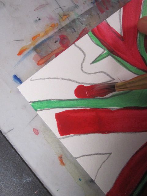
Use the shape of the brush to your advantage! Turn it on its skinny edge and press lightly to paint small or detailed areas.


This student rocked the project with his opposite hand! He was not expecting to have to try it, but once we taped his paper to the table he was off and running:)


A good number of students have finished already, and many have been coming in at recess since it has been unusually frigid her this week. Students will have a few minutes at the beginning of class next week to wrap these up.
Great to see you 4th graders!
Very nice! I love Hundertwasser!
ReplyDelete